Back to all case studies

Undergraduate work

Ra to take back home

A packaging design that introduces a traditional Sri Lankan coconut-sap drink to tourists as a take-home souvenir.
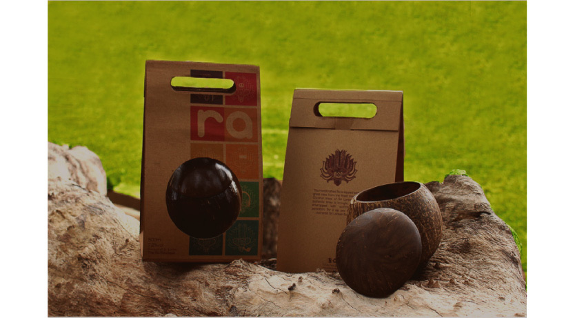
Two kraft paper Ra bags with a coconut shell cup and coconut shells on a log, the final packaging prototype.
Scope
Level II design project, Bachelor of Design
Duration
4 months
Focus
Prototyping, branding, graphics and illustration
Audience
Backpackers and travellers who buy Sri Lankan liquor at duty free outlets

Overview

Ra to take back home is a packaging design project that was carried out as a requirement of the Level II academic design projects.

What is Ra? An alcoholic beverage made from the sap of the coconut tree. It is fresh and sweet in the first 24 hours after it is collected, then it can become sharp and sour. It contains a higher alcohol percentage than beer, and has more health benefits when consumed fresh or preserved.

The problem and the challenge

The problem: The consumption of Ra is limited to low-income fishermen, coastal area workers and the workers of the estates in the hill country.

The challenge: Getting the attention of a new target audience of tourists who want to recall their experience of authentic alcoholic beverage consumption in Sri Lanka.

The target audience: Backpackers who hang around the Hikkaduwa area and admire hippie culture, and travellers who take Sri Lankan liquor from duty free retail outlets.

Execution

I invented a packaging design that merges the traditional Sri Lankan devil mask with hippie identities, to bring out a unique identity for a revamped Ra.

Design developments
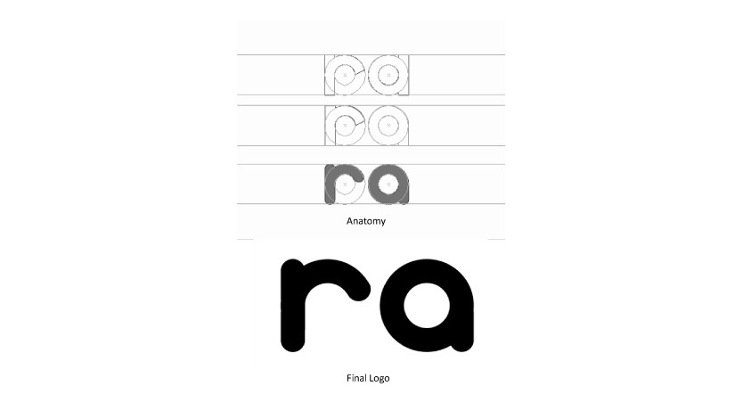
Ra logo development: a construction grid and the anatomy of the rounded lettering, above the final black “ra” logo.
Logo development.
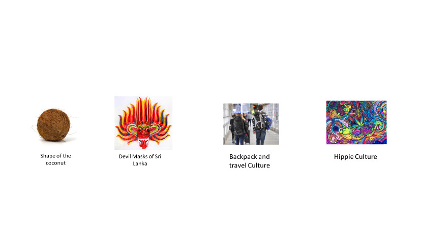
Four sources of inspiration: the shape of a coconut, the devil masks of Sri Lanka, backpack and travel culture, and hippie culture.
Inspiration.
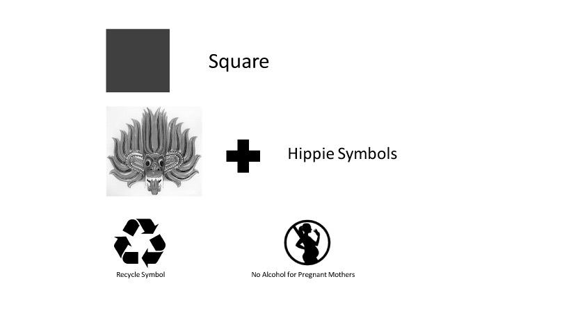
Ideation sheet: a square combined with the devil mask and hippie symbols, including the recycle symbol and the symbol for no alcohol for pregnant mothers.
Ideation.
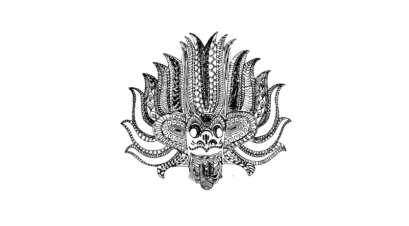
Detailed black ink illustration of the Sri Lankan devil mask with an intricate patterned headdress, the identity of the brand.
Identity.
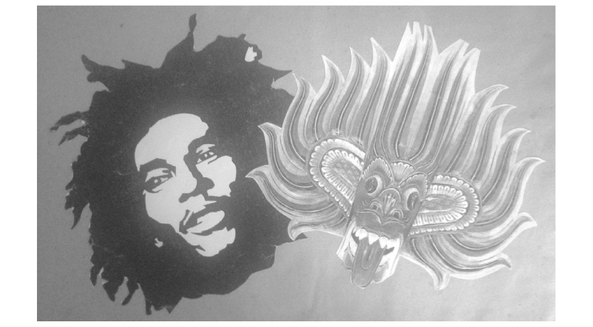
Graphics experiment: a stencil-style portrait of a man with dreadlocks placed beside the devil mask.
Graphics experiments.
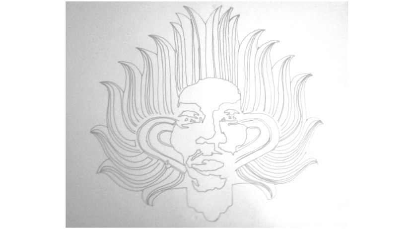
Pencil sketch where the dreadlocked portrait merges with the flame-like headdress of the mask.
Graphics experiments, merging the portrait with the mask.
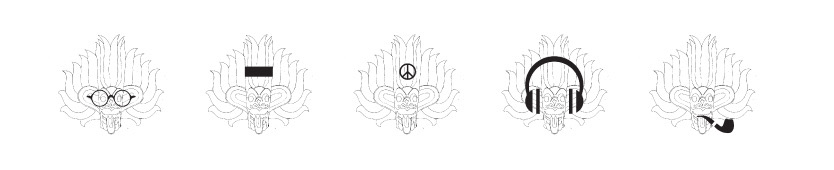
Five line drawings of the mask, each with a different accessory: round glasses, a bar, a peace symbol, headphones and a pipe.
Graphics experiments, mask variations.
A colour palette of twelve swatches: dark reds, red, greens, oranges, yellows, teal and purples.
Colours.
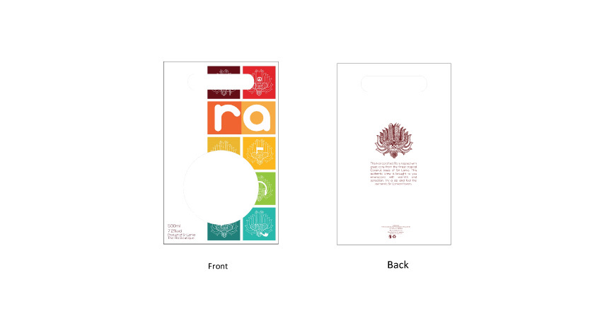
Front and back layout of the Ra package. The front shows the logo above a grid of coloured squares with the mask; the back shows the mask with descriptive text.
Layout, front and back.

Final prototype

Two kraft paper Ra bags with a coconut shell cup and coconut shells on a log, the final packaging prototype.
The final prototype.